I blogged about the post of adding shades of pink for your home last month, pairing the pinks can go beautifully with the whites. What about vibrant and vivid colours such as orange and red? Or the rare combination of purple, red and green? As I surfed through the net, I saw this project by Free Space Intent which make me bookmarked this project into my Interior Design Inspiration list for future reference for my upcoming future flat. Hence, I thought I will do up a post to share with my readers on this beautiful colour schemes!
* * *
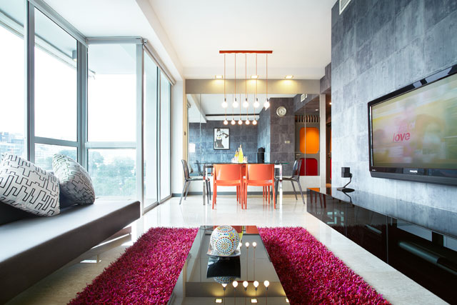
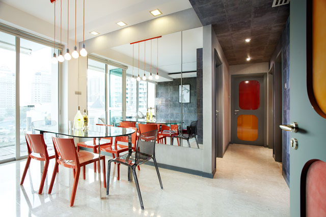
This project was done by Free Space Intent, on a 4-room condominium where you can see that they decided to go for red-orange scheme pairing with the somber grey walls to give the whole room a lively and vibrant atmosphere.
In this project, the designers painted walls of the living andf in black-grey colours which is usually not a common choice for many as dark walls may seem too serious or sombre. But they cleverly paired Vividly colored furniture and decorations which help to soften the impact of black walls as well as to revitalize the room. This pairing make it dramatically beautiful, soothing and indisputably stylish with a modern touch. With the playful interaction between the dark walls and white floorings, it helps to strike a balance in the room design as well. Lots of natural light is also a prerequisite. The reason for including the big windows is to allow a heavy dose of natural light which can help brighten up the room, defining and enhancing the space. And of course, lighting fixtures of beautiful design will also help to beautify the home as well. If you have a small living room, including mirrors can help to make the room looks bigger and spacious.
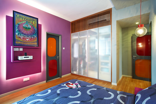
For the bedroom design, the designers decide to give the rare colour combination of purple and red. By choosing purple as the basis of the room while red is the accent, with a touch of green, this give the room an extra edge, making the room looks sophiscated and classy. As the colours are quite dark in my opinion, bringing as much light as possible will be important as well. I like how they choose to place the false wall lighting because it give a really beautiful and relaxing effect to the room, making the colours look more vivid.
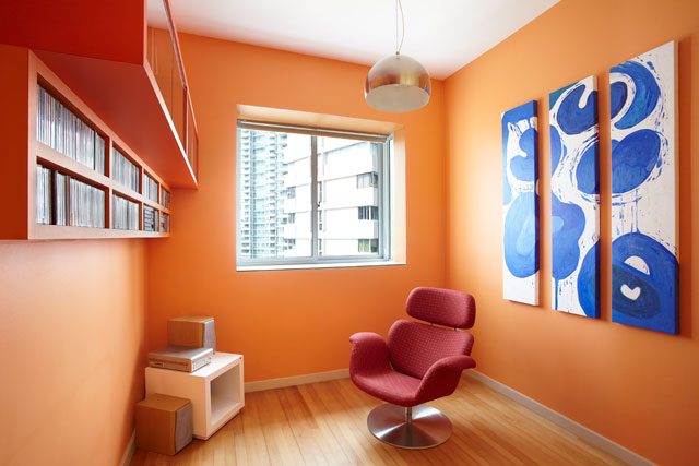
I do not really quite like this room design because I feel that shade of orange used for the walls does not blend well with the light shade of brown flooring. I would prefer that the flooring would be in darker shade of brown so that it will make the orange looks more contrast and appealing. But putting that aside, decoratives also matters in the interior design. With the addition of the blue and white decorative painting, it helps to make the room more pleasing to my eyes because blue always work well with the orange as blue and orange complement each other.
* * *
So far, I quite like this project!
For more pictures of this beautiful home, you can visit this link: The Ansley @ Mandalay Road.
Disclaimer: All pictures are taken from Interior Design Singapore unless stated otherwise. However, content and opinions are of my own.


