Neutral usually means without color. Neutral colors such as beige, ivory, taupe, black, gray, and white appear to be without color, and yet in many applications these hues often have undertones of color. – http://interiordec.about.com
Neutral colours are excellent choice for designing your own homes because of the flexibility and possibilities that neutral colours can provide. Neutral colours can provide a very calming and soothing atmosphere, while giving your home a very posh and elegant look. It is very easy to create various type of themes using neutral colours, and pairing with stylish furnitures, decor accessories and wall paint colours. So neutral colours may looks boring on its own, but with some tweaks and the right choice of colour combinations, you can create interesting environment and yet subtly stylish in your own home.
* * *
Choosing Neutral Tones Design Concept
Sourcing through InteriorDesignSingapore.com, I came across this renovation project done by Absolook Interior Design Pte Ltd on 5-room HDB BTO flat. They use mainly neutral colours, and pairing with contrasting furnishings and decorations which create a very simple yet stylish look.
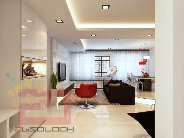
Living room
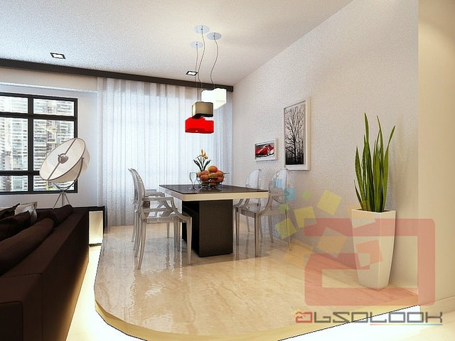
Dining room
I like how Absolook Interior Design play around with the neutral colours, choosing a peaceful neutral palette and pairing with chocolate brown furnishings with hint of red colours. Chocolate always make an excellent combination with neutral palette. Together with the plain white curtain by the window, it create a restful colour palatte which can provide the feeling of the house being spacious yet inviting. They also make a brilliant choice of implementing hint of red as red harmoniously matches with the white and beige interior of the room, creating a very clean and classic look!
Look at the dining room! You can never go wrong with the addition of the ‘floating’ platform with light! I have a fascination for floating platforms with light because they looks so luxurious, making the whole room feel so incredibly beautiful. Add on the flowers and fruits, you can see how the whole room can be brighten up with such colours! Beautiful paintings and wall hangings can never go wrong with the room either. <3
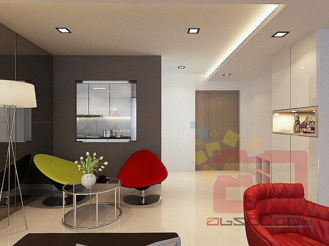
Kitchen view
Same goes for the kitchen’s area interior design where the walls and furnishings complemented with the neutral surroundings . I like how they create an opening to the kitchen, which allows more lighting into the kitchen, creating a less confined space.
Moving on to the rooms:
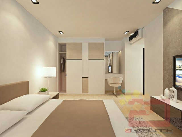
Bedroom
Bedroom
Bedroom
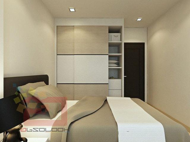
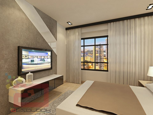
Creating a very relaxing atmosphere is always of importance for master bedroom (in my opinion). This time round, they applied monochromatic interior decorating color scheme, creating a lovely group of naturally matching colours. The brown tones and grey wall with a nice shade of white cut across, their colours are perfectly in sync with the whites and beige, beautifying the interior design. The use of neutral-toned accessories such as the grey rug and white decorations add to the earthiness and texture to the room. The layered tones create such a rich and airy feel, it will be such a comfortable feeling just to be in those rooms!
Study Room
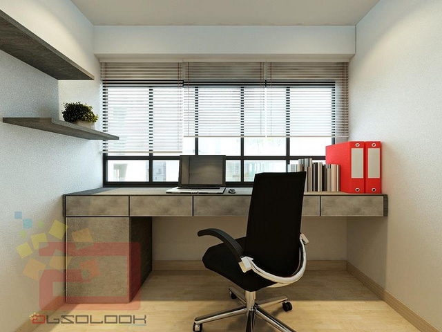
Choosing the right choice of colours for the study room is essential because it is a place which is destined to be used for work or study, and a place which reflect your own individuality. Creating an environment that best suited the person’s needs can helps to create interest in work. In my opinion, a study room should have a serious and yet comfortable atmosphere to allow one to concentrate and work better. Wall dressing is also important because choosing the right colours for wall paint/dressing will allow the person to be focused and also soothing. In this picture, brown tones are used in complement with the neutral walls, which create a comfortable environment for a study room. A stylish, black chair helps to prevent the room from looking cold and serious, and the addition of the platforms which allows one to put decorations/books such as potted plant as shown, can helps to make the overall looks casual and comfortable. It will be nice to hang a lovely landscape framed picture or wall hangings to create a cheerful and classic look. One can add flowers to bring up the energy level of the room as well.
Toilet
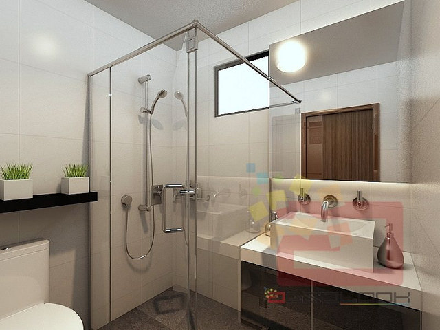
Toilet
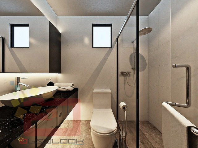
Again, the colour scheme used is similar as used for the bedrooms and study room. One feature for this project is the glass walled shower area and big mirrors which create a very spacious toilet despite the small confined space. I love how they decorate the toilets which display a hint of classiness and elegance. Very sophisticated feel! I couldn’t comment much on lighting as I couldn’t see much in the pictures, but a point to note that lighting is also very important in playing a part in the interior design.
* * *
Overall, I pick this project out to feature because I feel that the overall look is really beautiful with such nice, contrasting colour combinations in every room. I love the floating platform of the dining room the most, followed by the interior design of the living room because of the neutral-hue space!
Disclaimer: All photos taken from InteriorDesignSingapore.com, provided by Absolook Interior Design unless otherwise stated, but all opinions and thoughts are of my own.

2 comments
Wow the interior design of these rooms are so simple but so modern. I love it. Thank you for sharing!
Sincerely,
M.
http://www.styleonmars.wordpress.com
Thank you 🙂 I love the simplicity yet classic look myself. Glad you enjoy the read 🙂